Checkerboard Tile Is Back:
A Timeless Pattern with a Modern Twist

A Timeless Pattern with a Modern Twist
Some design trends come and go, while others find new ways to feel fresh generation after generation. Checkerboard tile is one of those enduring classics.
Long associated with elegant European homes, vintage kitchens and traditional entryways, checkerboard flooring is making a stylish return. But today’s interpretation goes well beyond the familiar black-and-white squares.
With softer colors, natural stone, interesting textures and unexpected combinations, checkerboard tile is proving that a classic pattern can feel right at home in modern, transitional and traditional interiors.
Whether you’re planning a bathroom remodel, updating an entryway or looking for a way to add personality to your kitchen, checkerboard tile offers a beautiful combination of character and timeless appeal.
Checkerboard floors have been used in architecture and interior design for centuries. Their simple geometric pattern creates visual interest without requiring an elaborate design.
What makes checkerboard tile especially appealing today is its versatility.
While bold black-and-white floors remain a classic choice, designers are embracing more understated combinations. Think creamy beige paired with warm taupe, soft gray with white marble, or muted green with natural stone-inspired finishes.
These updated palettes allow checkerboard tile to make a statement without overwhelming the room.
The pattern also fits beautifully with today’s interest in interiors that feel collected, personal and full of character rather than overly uniform.
One of the most exciting things about modern checkerboard tile is the range of colors and materials available.
There’s a reason black-and-white checkerboard flooring never completely goes out of style.
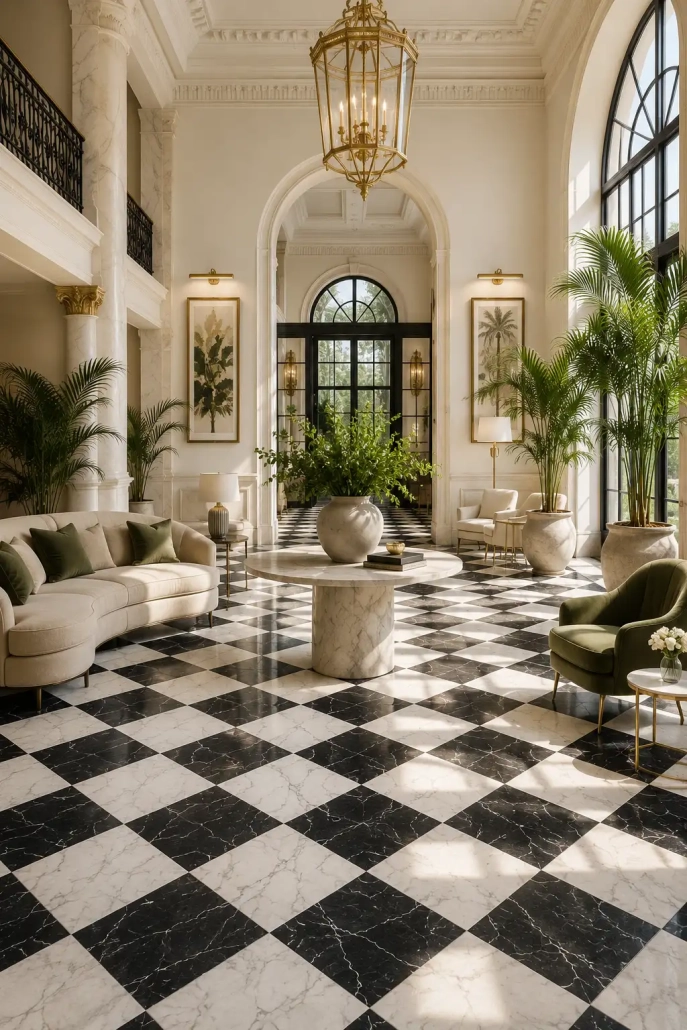
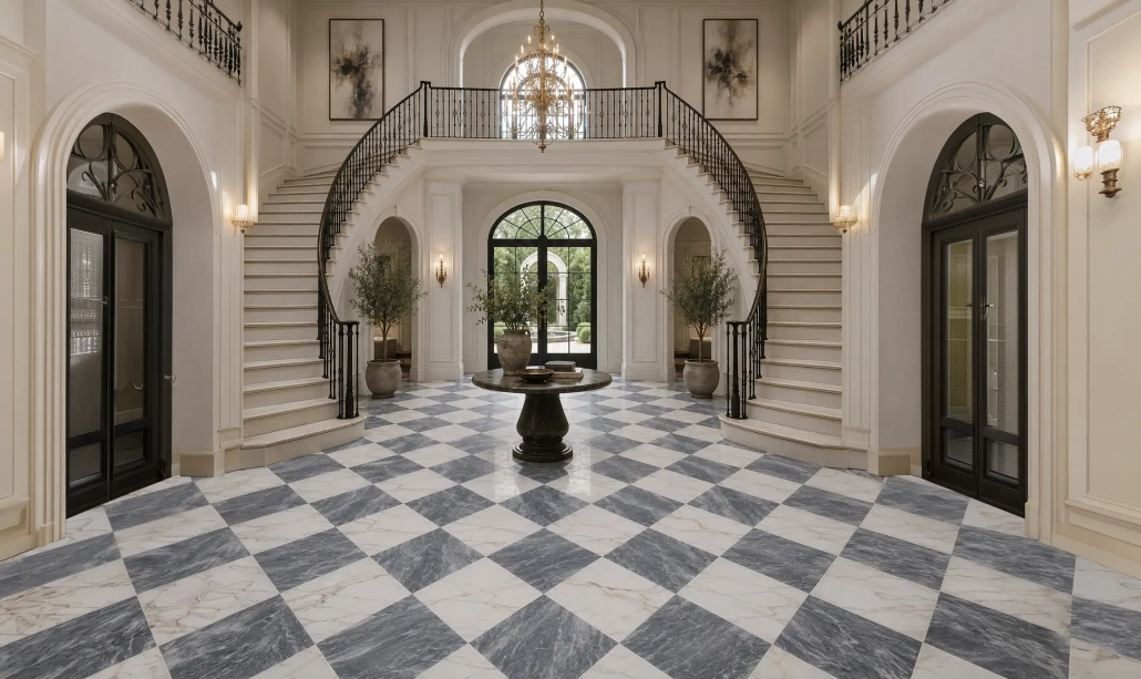
The contrast is crisp, graphic and instantly recognizable. It can feel vintage in a traditional kitchen, elegant in a marble entryway or surprisingly contemporary when paired with clean cabinetry and minimal furnishings.
Black-and-white checkerboard tile works particularly well when the surrounding finishes are relatively simple, allowing the floor to become the focal point.
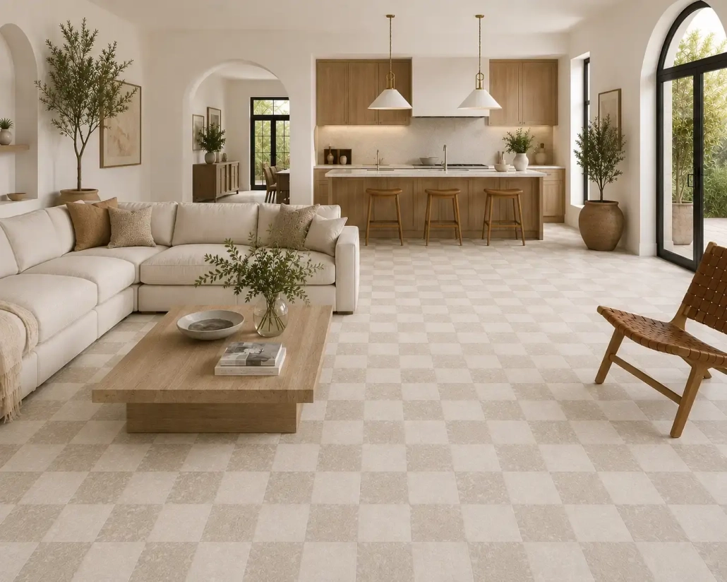
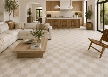
For homeowners who appreciate the checkerboard pattern but want something softer, warm neutral combinations are a beautiful alternative.
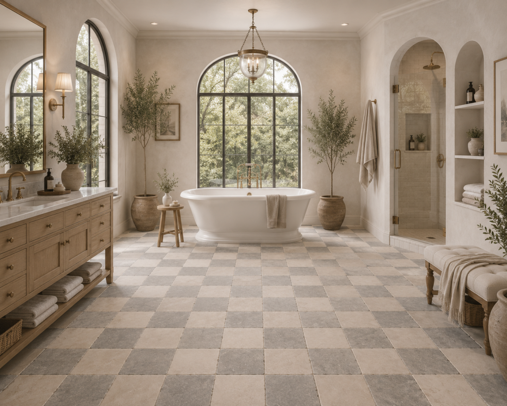
Cream, sand, taupe, caramel and soft brown can create a more relaxed interpretation of the design.
These colors coordinate especially well with natural wood cabinetry, warm white walls, brass accents and organic textures.
The result is a patterned floor that adds depth and personality without feeling overly dramatic.
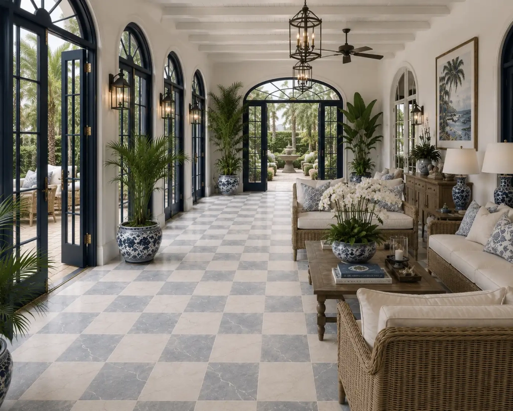
Gray-and-white checkerboard tile creates an elegant look that can work in both traditional and contemporary homes.
When paired with marble or marble-look tile, the subtle movement and veining help soften the geometry of the pattern.
This combination can be particularly beautiful in bathrooms, laundry rooms and entryways.
Checkerboard doesn’t have to be neutral.
Muted green, blue, terracotta and other complementary colors can create a distinctive floor with plenty of personality.
These combinations are especially appealing in smaller spaces where homeowners may feel more comfortable experimenting with color and pattern.
A laundry room, powder room or mudroom can be the perfect place to introduce something a little unexpected.
The material you choose can make a significant difference in both the appearance and maintenance of your floor.
Natural stone checkerboard tile offers organic variation, distinctive veining and character that can’t be duplicated exactly from one piece to the next.
Marble is particularly beautiful in checkerboard designs because the natural movement in the stone adds another layer of visual interest.
However, natural stone generally requires more careful maintenance and may need sealing. Some stones are also more susceptible to staining, scratching or etching than porcelain.
Porcelain checkerboard tile offers another approach.
Porcelain is available in a wide variety of colors, finishes and stone-inspired visuals. It can provide the appearance of natural materials while typically offering easier maintenance and strong durability.
For busy Minnesota households, porcelain may be especially appealing in hardworking areas such as mudrooms, kitchens and entryways.
Neither material is automatically the better choice. The decision depends on the look you want, the location, your maintenance preferences and the specific product’s performance characteristics.
One of the advantages of checkerboard tile is that it can work in spaces of many different sizes.
An entryway is a natural place to introduce checkerboard flooring.
Because it’s often one of the first things guests see, a patterned floor can immediately establish the character of your home.
In Minnesota, entryways and mudrooms also need to handle snow, moisture, dirt and everyday traffic. Selecting a tile with the appropriate durability and slip-resistance characteristics is just as important as choosing the pattern.
A warm neutral checkerboard floor can create a welcoming transition from the outdoors while adding visual interest to a practical space.
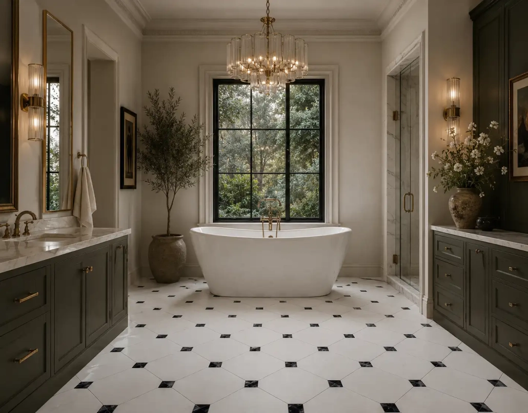
Checkerboard tile can bring personality to bathrooms without relying on overly decorative finishes.
A soft marble combination can create an elegant, spa-inspired atmosphere, while a more contrasting pattern can give a powder room a charming vintage feel.
Pairing a checkerboard floor with simple wall tile, understated cabinetry and coordinating fixtures helps keep the room balanced.
For wet areas, be sure the selected tile is appropriate for the application, particularly when slip resistance is a consideration.
Checkerboard kitchen floors have a long design history, but they don’t have to feel old-fashioned.
Today’s combinations of warm wood cabinets, natural stone countertops and muted checkerboard tile can create a kitchen that feels both welcoming and sophisticated.
The key is balancing the pattern with the other finishes.
If the floor is visually prominent, simpler backsplash tile and cabinetry can help create a cohesive appearance.
Laundry rooms are a wonderful place to have a little fun with tile.
Because they’re often smaller and more functional, they offer an opportunity to introduce pattern without committing to it throughout the main living areas.
A checkerboard floor can turn an otherwise ordinary utility space into something that feels thoughtfully designed.
Choosing the colors and materials is only part of designing a checkerboard floor. The layout can dramatically change the finished appearance.
A traditional straight layout places the squares parallel to the walls, creating a clean, orderly pattern. This approach works beautifully in classic and contemporary spaces.
A diagonal layout rotates the pattern approximately 45 degrees, creating a diamond effect.
Diagonal checkerboard floors can introduce movement and make a space feel more dynamic. They’re especially striking in entryways, hallways and rooms where the pattern can be appreciated from a distance.
The best layout depends on the room’s dimensions, architectural features and how the tile will transition into surrounding flooring.
Absolutely.
Smaller checkerboard tiles create a more detailed, traditional appearance, while larger squares make a bolder statement.
For example, a 12-by-12-inch tile may work beautifully in a bathroom or laundry room. Larger formats can create a more expansive checkerboard design in kitchens, entryways and open living spaces.
However, bigger isn’t always better.
Room dimensions, grout joints, tile cuts and the placement of fixtures all influence how the pattern will look once installed.
A thoughtful layout can make the difference between a floor that feels intentional and one that looks awkward or unbalanced.
Checkerboard flooring naturally attracts attention, so it’s important to consider the rest of the space.
That doesn’t mean everything else has to be plain. It simply means giving the design room to breathe.
If you’re using a bold black-and-white floor, consider softer wall colors, uncomplicated cabinetry and subtle textures.
For a warm neutral checkerboard, natural wood, woven materials and layered fabrics can reinforce the relaxed appearance.
You can also repeat one of the tile colors elsewhere in the room through cabinetry, countertops, window treatments or accessories.
The goal isn’t to match everything perfectly. It’s to create a visual connection between the floor and the surrounding finishes.
One beautiful example of this updated approach comes from Virginia Tile’s Checkerboard Collection.
The collection highlights natural marble in classic combinations, along with porcelain and other stone-inspired options that demonstrate just how versatile the pattern can be.
Some combinations feature dramatic black-and-white marble, while others incorporate softer grays, creamy neutrals and warm earth tones.
Virginia Tile also showcases traditional square layouts, diagonal installations and subtle tone-on-tone combinations.
It’s a great reminder that checkerboard tile isn’t one specific look. The same simple pattern can feel formal, playful, modern, vintage or understated depending on the materials and colors selected.
It’s a fair question, especially when you’re choosing a material that you expect to enjoy for many years.
Checkerboard tile may be receiving renewed attention, but the pattern itself is far from new.
Its longevity is one of its greatest strengths.
The key to creating a floor that will age well is choosing a combination that complements your home’s architecture and your personal style rather than selecting something simply because it’s popular right now.
A subtle marble checkerboard may feel timeless in a traditional home, while an earthy porcelain combination may be better suited to a relaxed, contemporary interior.
When the design feels connected to the rest of your home, it’s much more likely to remain appealing long after the current trend cycle.
Checkerboard tile is proof that a simple pattern can make a lasting design statement.
From classic black-and-white marble to warm neutral porcelain and unexpected color combinations, there are countless ways to make this timeless look your own.
At House2Home Flooring & Design Studio, we can help you explore tile options, compare colors and finishes, and coordinate your selections with flooring, cabinetry, countertops and other elements of your space.
Whether you’re updating a bathroom, designing a kitchen or creating a memorable entryway, our team can help you find the right balance of pattern, color and functionality.
Stop into our Ham Lake showroom with your inspiration photos and project ideas. We’d love to help you create a space that feels uniquely yours.
H2H – from inspiration to installation.
 https://house2homeflooring.com/wp-content/uploads/2026/11/checker-Feature.png
323
453
Candy Weisenberger
https://house2homeflooring.com/wp-content/uploads/2019/04/House2Home-Logo-Color.png
Candy Weisenberger2026-11-03 12:09:582026-10-12 20:31:25Checkerboard Tile Is Back: A Timeless Pattern with a Modern Twist
 https://house2homeflooring.com/wp-content/uploads/2026/10/motor-Feature.png
323
453
Candy Weisenberger
https://house2homeflooring.com/wp-content/uploads/2019/04/House2Home-Logo-Color.png
Candy Weisenberger2026-10-27 12:42:172026-09-29 17:26:00Motorized Window Shades: Are They Worth It?
 https://house2homeflooring.com/wp-content/uploads/2026/09/Privacy-Feature.png
323
453
Candy Weisenberger
https://house2homeflooring.com/wp-content/uploads/2019/04/House2Home-Logo-Color.png
Candy Weisenberger2026-10-13 15:53:392026-09-29 16:39:35How to Choose Window Treatments for Privacy Without Losing Natural Light

Tues: 8am – 7pm
Mon • Wed • Thurs • Fri: 8am – 6pm
Saturday: 10am – 4pm
Sunday: Closed